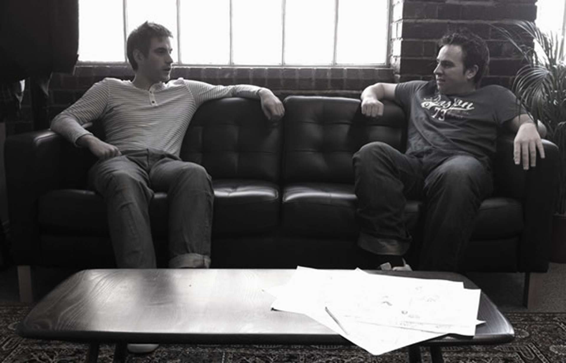
The other week, I kicked off my Design Tour of The Midlands with a visit to The Higgs Design Co.

Founded by Andy Higgs in 2006, the studio has quickly gathered a reputable group of clients, ranging from successful local startups to International suppliers.
The Higgs Design Co pride themselves on creating "considered web application and design work" with a heavy emphasis on providing the ultimate user experience, advising customers on how best to achieve this. There are too many studios in the industry who are "Yes Men", simply ticking the boxes of client's requirements but The Higgs Design Co aim to address that head on by working with customers to think about what it is their customers actually want. Ultimately, they like to work with businesses to grow them, online and offline.
This practise is evident from their recent work with Urban Coffee Co in Birmingham.
The small coffee shop in the centre of Birmingham is popular amongst the creative community so The Higgs Design Co advised Urban Coffee Co how to best utilise social media to grow their brand online. As part of a redesign, Higgs made sure social media was at the centre of the Urban Coffee Co experience, using services like Foursquare and Twitter to communicate with their audience.
Going forward, Higgs are now working on the ecommerce element of the Urban Coffee Co website, allowing customers to purchase their renowned coffee as well as giving the business an opportunity to extend their reach outside of Birmingham City Centre.
Higgs are also currently working on a complete redesign of UK startup Rate My Placement which Andy has been heavily involved in from the start.
Back in 2006, three (bored) students on placement from Loughborough University realised there wasn't enough information out there for universities to assist placement students so they set out to resolve this.
Fast forward five years and the small startup is now a team of 15 with the goal of reorienting the product to a web application with more emphasis on the user, expecting to be launched in late part of 2011.
The Higgs Design Co are also working closely with a number of other clients, including the world's most prestiges rose suppliers David Austin Roses and racing driver Adam Christodoulou.
Design In The Midlands #
I was keen to find out what Andy thought of the Midlands' creative scene, why the area tends to get overlooked in the Web sphere.
His initial reaction was that many people in the region don't tend to shout about what they do, the good things don't get talked about.
As a whole, people in the Midlands are quite self-deprecating "“ it seems to be one of our many qualms and we don't defend the area when outsiders say "it's shit". In a recent article by the Independent, Birmingham "“ the UK's "second city" "“ was classed as a third-rate city, which says a lot about the general consensus of the public, compared to people in Manchester and Liverpool who claim London as the "second city".
Another fault seems to show that the city is divided. For example, two of Birmingham's main creative hubs, the Jewellery Quarter and Digbeth, have specific boundaries with little crossover in their communities, yet both have creatively strong communities.
Birmingham is generating a lot of talent, through the many universities and colleges, so there should be plenty of opportunity for growth.
The best approach to dealing with the creative silence is to continue developing local businesses, but making more noise about what we do, channeling the enthusiasm into public voice.
The Grid Challenge #
I was keen to make the most of the trip to The Higgs Design Co so took a design challenge for them.
I'm currently working on an internal CRM solution for Premium Choice and I've got to a situation where users like a full screen "liquid" UI yet there are obvious barriers with designing such interfaces, especially with standardised grids, so I'm keen to push a fixed grid.
Both solutions have their pitfalls so we discussed the differences between fixed, liquid and responsive grids.
In the end, responsive seemed like the most suitable approach to cover the numerous use cases, such as operational users on 1024x768 resolutions, management on wider resolutions and the potential to introduce smaller designs for portable devices such as iPads.
As part of this, Andy suggested a 16px baseline which he has used on a number of previous projects as it is relatively easy to remember multiples using typical computer bit rates.
To make the grid even more flexible, we introduced a naming convention for adopting columns with different amount of units:
- 3 column layout (33% and 67%)
- 2 column layout (50/50)
The new system also allows for an optional 16px padding to a column, reducing the column width to avoid broken columns. See the sample document for some example use cases.
Summary #
Considering The Higgs Design Co have only been in the creative hub of Birmingham's Jewellery Quarter since February, the future of the company is looking pretty solid for the near future. Expect to see a lot more from these guys over the coming years.