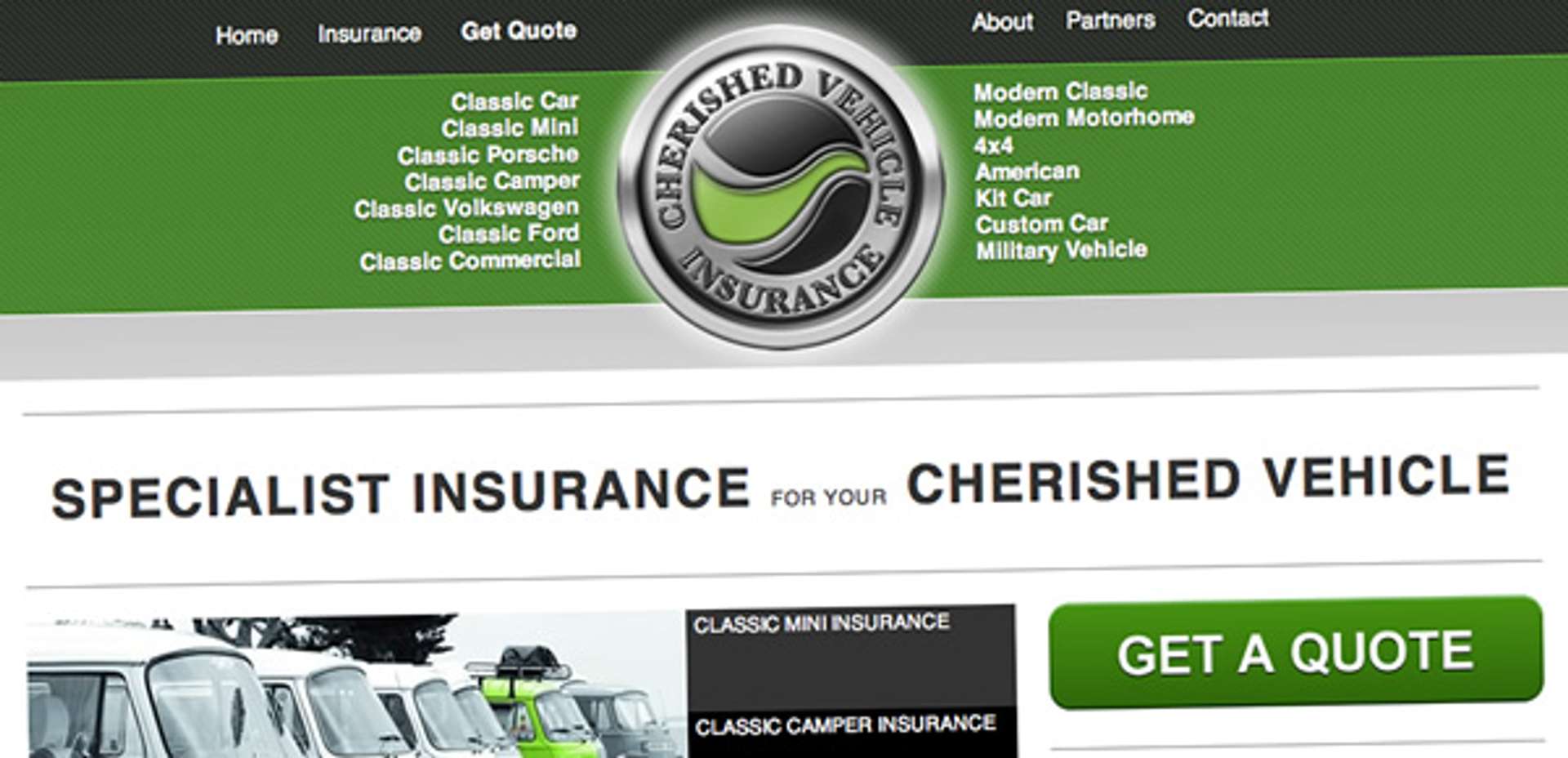
 As part of the strategy to create and establish niche products at Premium Choice, we have recently identified a market for the specialist vehicle insurance range of customers in Cherished Vehicle Insurance.
These insurance packages aren't for your typical run-around car - more the Pride and Joy you keep in the garage for special occasions. We're talking about original Minis, classic Campers and even tanks - this is specialist insurance for cherished vehicles.
I was heavily involved in the project direct from the start. The business knew it was important to use the Web as a platform to promote the new business so were keen on my input from the start.
We were keen to establish a brand that the target audience would identify with, something that said "classic" and "cherished". As this would be a trading style of Premium Choice, I was keen to incorporate their established identity in some way. After some brainstorming sessions, we decided to use the globe icon in a mock car badge environment but with a different colour scheme. Bearing in mind many of the vehicles insured are classic, some of which with British heritage, I liked the idea of using a British Racing Green. After several attempts and revisions of the logo, we decided on a slightly lighter tone which worked well both on screen and in print.
While we outsourced a lot of the marketing tasks to local design agency DG2, it was clear we wanted a consistent marketing message across all the forms of media involved. DG2 came up with some fantastic proposals with powerful messages and iconic images and we were keen to incorporate as many of these messages within our online marketing campaign.
Having established a brand that the whole company were behind and just three weeks to launch, it came down to me to design a website that portrayed the company in a contemporary yet classic way. I wanted to adopt a contemporary appearance, using good whitespace and classic typography to give the website a classic feel.
Due to the specialist nature of the business, online quotes weren't immediately available so the calls to action were simply down to lead generation, ie. via telephone and email. It was essential these calls to action had prominent position within the design so placed these channels of communication towards the top of every page to ensure they were the first elements visitors would see.
We were also keen to get across the personal service available, how most of the staff actually understand what the customers are talking about, that many of them are specialist enthusiasts as well. We arranged a shoot with Birmingham photographer Darren Harvey and the project leader's own classic Mini for use within the website.
We're also planning to embrace social networks like Twitter and Facebook to get across the friendly service available, as well as using services like Flickr and YouTube to share image and video case studies with customers of what the team actually get up to out of hours. The team were already using specialist forums as a platform for personal use so using these channels were just an extension of their current activity in a more commercial environment.
In a somewhat competitive market like insurance, it was essential we used Google Adwords to get the service out to the masses. This was paramount to the marketing campaign and we are constantly monitoring and adapting our Pay-Per-Click campaigns to ensure we are capturing the right audience with a service they actually want.
The whole project has been really enjoyable to work on but this is just the beginning. We have many plans to evolve the online presence of CVI and I'm really proud to be a part of it.